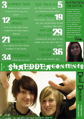
My contents page is much more complex and colourful. I made sure to use a minimal amount of fonts, to keep a theme ongoing from the cover other than the colours. I have used two of my own images, and kept the style simplistic, yet not so mch as to be boring. If I had a chance to improve the work I would make sure to include more space for extra images and more page outlines.

For my double page spread, I decided to keep the theme simplistic, as I wanted to have a substantial amount of text in the interview. Due to this, I only used a plain white background, which I think works effectively.


