In what ways does your media product use, develop or challenge forms and conventions of real media products?
The header font I used may be seen as challenging convention, as although the letters are bold Sans Serif font, they have a distortion over the top. I used a conventional centred image, and placed my titles around this, much like any magazine you could find on the market. This is because it makes the cover easier to look at, providing you don’t overload the space.I kept my masthead over the top of the image as my media product is not well know, and therefore people need to know the title. With my magazine I wanted to try and make it clear through the title what my magazine was about so I left the image and masthead separate. My contents page was inspired by that of Kerrang!’s when using the image to divide it up, and I decided to make the list of page numbers and titles less conventional in an attempt to be more attractive to the reader. My double page spread is a lot more simplistic than the conventional spread, as I wanted to maximise the impact of the interview, and reduce the amount of pictures to give it more purpose.
Who would be the audience for your media product, and how did you attract/address that audience? How does your media product represent particular social groups?
The audience for my media product would be those who follow the rock music scene, therefore the kind of people who would read Kerrang! and Rock Sound magazines.
Other than my main article, which was an unknown band, I made sure to use bands that were well known in the relevant music genre. I also used plugs such as 'exclusively'
My magazine is completely focused on the music it contains, and so only attracts a very specific audience to it. Because of this, my media product could be seen as to represent the social groups. If my product was perceived to represent its readers at all, it would probably represent them as very guitar and live music orientated due to the main content of the front cover. This is a deliberate representation, as the demographic I wish to appeal to are just that.
What kind of media institution might distribute your media product and why?
Bauer Media Group (BMG)is a large publishing company that I believe is most likely to distribute my media product, as it is of similar genres to other magazines that they publish such as 'Kerrang!'
What have you learnt about technologies from the process of constructing this product?
In the process of constructing my product, I discovered new features on desktop publisher and used them in my cover page. One of these includes editing the opacity of autoshapes. I used it on the banner across my main image, as I didn't want to cover the image completely, but I needed to create a background for the text to be readable.
Looking back at your preliminary task, what do you feel you have learnt in the progression from it to the full product?
I feel that my main task in the music magazine has progressed a lot from the preliminary task in that it looks like more of a professional magazine. I feel that my preliminary piece was a lot emptier than it should be, due to the picture being quite distant and creating a lot of white space. I improved on the font continuity in my music magazine, as although the previous task was quite continuous, there were still a few too many fonts. I also used too many boxes and shapes around my text on the preliminary task, which I have improved on.
Audience Feedback
I gave members of my class a peer evaluation sheet for my music magazine and got some of the following responses.
"Genre appropriate font and style", "angled texts and pictures create an 'edgy' feel", "colour highlights are used well (Green Day)", "unique masthead font", and "use of question and world trouble attracts attention".
My double page spread was praised, but also received comments about it being too plain and possibly boring to look at, which I agree with. This is one of the main things I would change in my media product if I redid it.
A main feature that others I have shown my piece to have mentioned is the colour scheme. It has been said that "the continuous colour scheme brings the pages together, and makes it quite attractive".
About Me

- Megan Hogben
- So I'm Megan. I'm a Media Studies student, so one of my blogs shall be dedicated to the production of my work. I've taken Media Studies (obviously), Psychology, English Language and Photography.
Tuesday 10 May 2011
Friday 8 April 2011
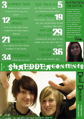
Music Magazine - Contents and double page spread
My contents page is much more complex and colourful. I made sure to use a minimal amount of fonts, to keep a theme ongoing from the cover other than the colours. I have used two of my own images, and kept the style simplistic, yet not so mch as to be boring. If I had a chance to improve the work I would make sure to include more space for extra images and more page outlines.
For my double page spread, I decided to keep the theme simplistic, as I wanted to have a substantial amount of text in the interview. Due to this, I only used a plain white background, which I think works effectively.


For my double page spread, I decided to keep the theme simplistic, as I wanted to have a substantial amount of text in the interview. Due to this, I only used a plain white background, which I think works effectively.

Tuesday 22 March 2011
Music Magazine - Front Cover
My music magazine has changed a lot over the time I've worked on it,

In the first draft, it was a lot more basic, as I had few titles and a non edited picture.

For my final draft, I have added titles to make sure the page is not empty, but not too many as for it to be busy. I included boxes with slight opacity to vary the presentation and focused the composition around the empty space in the photograph used for the background.
Thursday 9 December 2010
Music Magazine - Photography
I took quite a large amount of photos for my Magazine, as I wanted to make as many of them as possible my own.
I took part in a couple of photoshoots with my friend, Megan, and we both took images for our Media coursework. These images were taken with a white background for editing purposes as it made sure that the images looked studio based, and were not too visually noisy. Some of the unedited images I took follow.


I took part in a couple of photoshoots with my friend, Megan, and we both took images for our Media coursework. These images were taken with a white background for editing purposes as it made sure that the images looked studio based, and were not too visually noisy. Some of the unedited images I took follow.


Music Magazine - Audience research
I used survey monkey to construct an easily accesible questionnaire for my music magazine, and recieved 26 participants' results.
The questionnaire can be found here.
Due to my not having a premium account, I could only ask ten questions, but that was more than enough to gather the results I need.


Due to the results of this question, I have decided to call my magazine Shredder.


The questionnaire can be found here.
Due to my not having a premium account, I could only ask ten questions, but that was more than enough to gather the results I need.
I want my magazine to be based on rock music, so my questions were based on this. Following are my results to the survey:
Due to the results of this question, I have decided to call my magazine Shredder.
Music Magazine - Reader Profile
AGE: 15-25
GENDER: Unisex, but mainly male
MUSIC TASTE: Mainstream rock - pop rock, punk, alternative, screamo
CLOTHING/STYLE: Alternative, Punk
VALUES AND BELIEFS: Music matters most – support the artists. the music created, not the image and fame.
PERSONALITY: Varied possibilities from shy and introvert, to loud and extrovert depending on the individual. A method of helping those more worried about sharing their interests (due to common problems) to find others similar.
HOBBIES: Music orientated activities – gigs, playing, listening, creating
HATES: Conformity, Mainstream music, Idealism
SHOPS: Mostly online, alternative and less well known brands such as Criminal Damage, Masked Clothing and Dead Heroes Clothing. Band merchandise
FOOD AND DRINK: Energy drink and other unhealthy things.
Subscribe to:
Posts (Atom)